


Media Query ແມ່ນຫຍັງ?
Media Query ແມ່ນເຕັກນິກ CSS ທີ່ແນະນໍາໃນ CSS3
ເຕັກນິກນີ້ໃຊ້ກົດເກນ @media ເພື່ອລວມ block ຂອງ properties CSS ສະເພາະເມື່ອເງື່ອນໄຂບາງຢ່າງເປັນຈິງ
ຕົວຢ່າງ:
ຜົນລັບ:
Add a Breakpoint
ການນໍາໃຊ້ media query ເພື່ອເພີ່ມ breakpoint 768px:
ຕົວຢ່າງ:
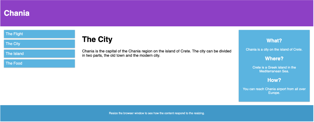
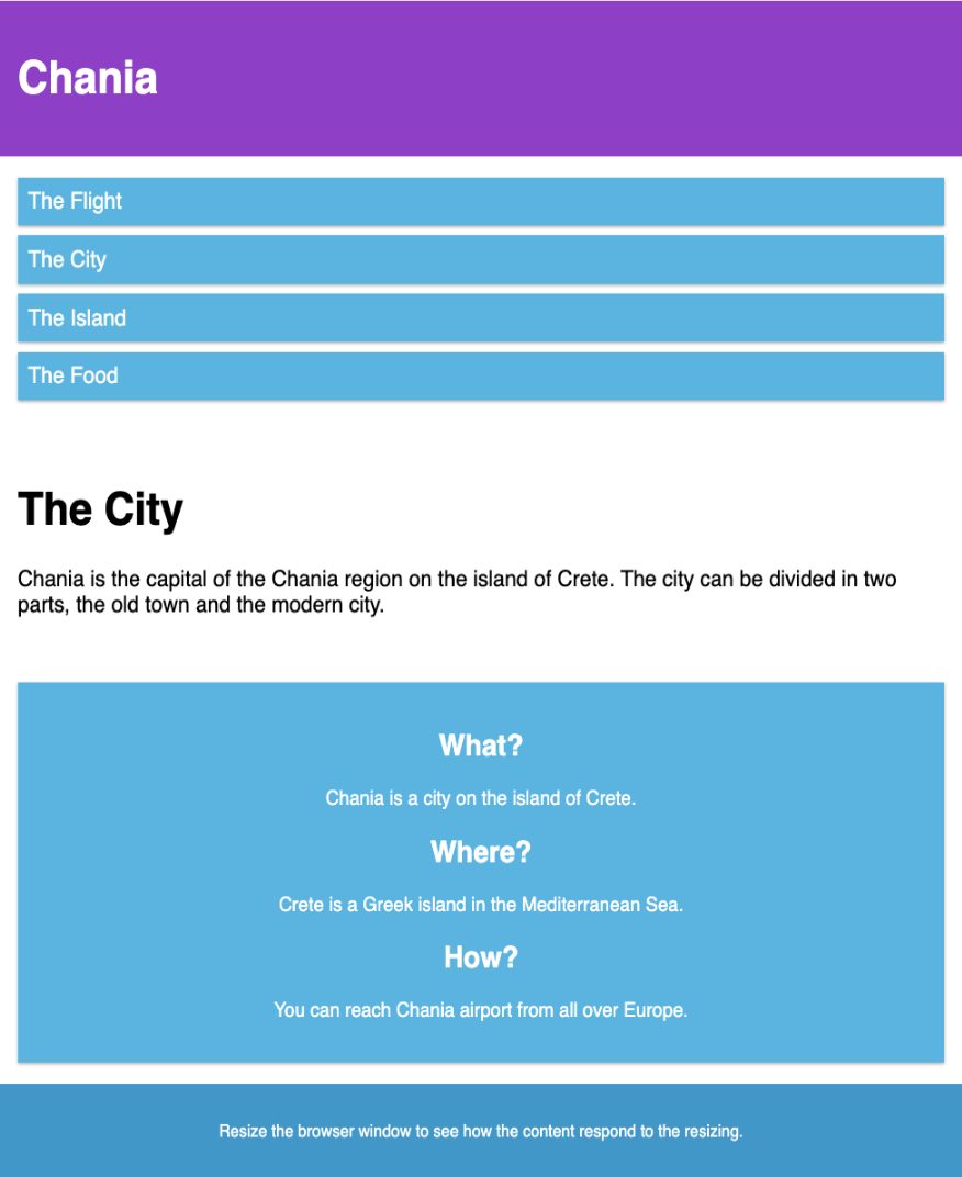
ເມື່ອໜ້າຈໍ (browser window) ມີຂະໜາດນ້ອຍກວ່າ 768 px, ແຕ່ລະ column ມີຄວາມກວ້າງ 100%:
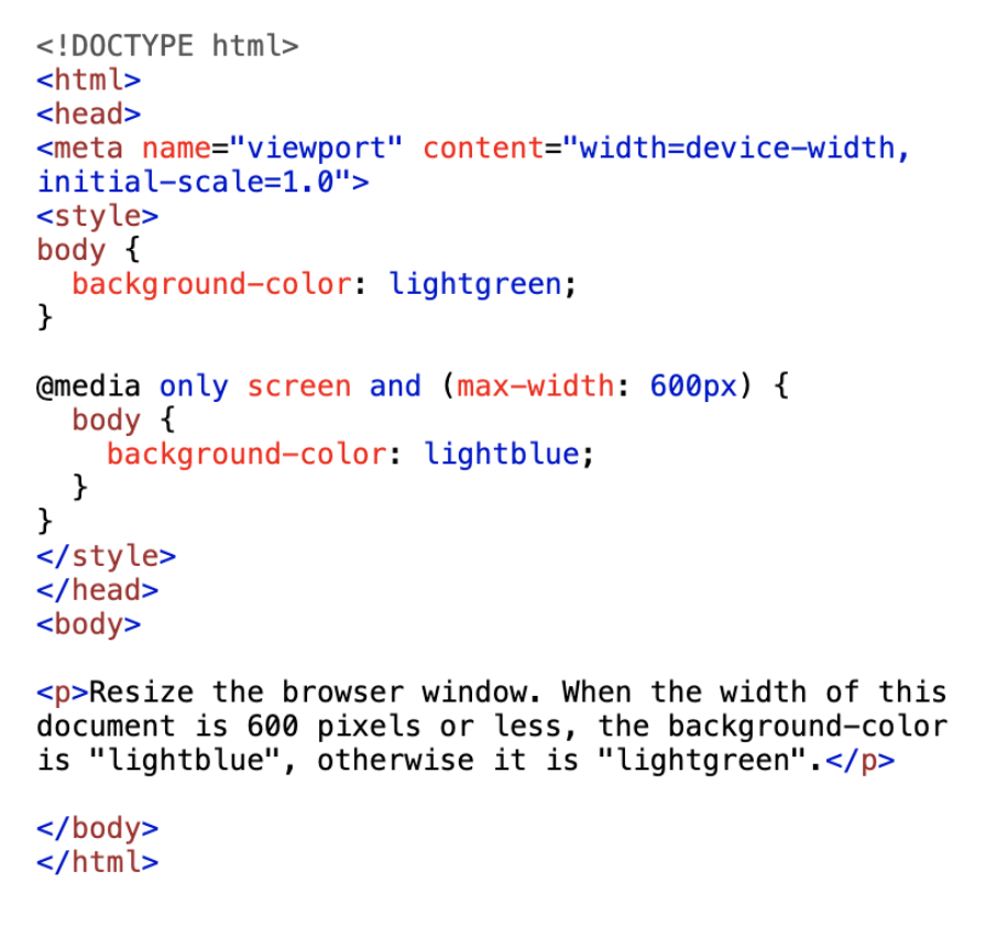
<!DOCTYPE html>
<html>
<head>
<meta name="viewport" content="width=device-width, initial-scale=1.0">
<style>
* {
box-sizing: border-box;
}
.row::after {
content: "";
clear: both;
display: block;
}
[class*="col-"] {
float: left;
padding: 15px;
}
html {
font-family: "Lucida Sans", sans-serif;
}
.header {
background-color: #9933cc;
color: #ffffff;
padding: 15px;
}
.menu ul {
list-style-type: none;
margin: 0;
padding: 0;
}
.menu li {
padding: 8px;
margin-bottom: 7px;
background-color: #33b5e5;
color: #ffffff;
box-shadow: 0 1px 3px rgba(0,0,0,0.12), 0 1px 2px rgba(0,0,0,0.24);
}
.menu li:hover {
background-color: #0099cc;
}
.aside {
background-color: #33b5e5;
padding: 15px;
color: #ffffff;
text-align: center;
font-size: 14px;
box-shadow: 0 1px 3px rgba(0,0,0,0.12), 0 1px 2px rgba(0,0,0,0.24);
}
.footer {
background-color: #0099cc;
color: #ffffff;
text-align: center;
font-size: 12px;
padding: 15px;
}
/* For desktop: */
.col-1 {width: 8.33%;}
.col-2 {width: 16.66%;}
.col-3 {width: 25%;}
.col-4 {width: 33.33%;}
.col-5 {width: 41.66%;}
.col-6 {width: 50%;}
.col-7 {width: 58.33%;}
.col-8 {width: 66.66%;}
.col-9 {width: 75%;}
.col-10 {width: 83.33%;}
.col-11 {width: 91.66%;}
.col-12 {width: 100%;}
@media only screen and (max-width: 768px) {
/* For mobile phones: */
[class*="col-"] {
width: 100%;
}
}
</style>
</head>
<body>
<div class="header">
<h1>Chania</h1>
</div>
<div class="row">
<div class="col-3 menu">
<ul>
<li>The Flight</li>
<li>The City</li>
<li>The Island</li>
<li>The Food</li>
</ul>
</div>
<div class="col-6">
<h1>The City</h1>
<p>Chania is the capital of the Chania region on the island of Crete. The city can be divided in two parts, the old town and the modern city.</p>
</div>
<div class="col-3 right">
<div class="aside">
<h2>What?</h2>
<p>Chania is a city on the island of Crete.</p>
<h2>Where?</h2>
<p>Crete is a Greek island in the Mediterranean Sea.</p>
<h2>How?</h2>
<p>You can reach Chania airport from all over Europe.</p>
</div>
</div>
</div>
<div class="footer">
<p>Resize the browser window to see how the content respond to the resizing.</p>
</div>
</body>
</html>
ຜົນລັບ:
ອອກແບບໃຫ້ລະບົບມືຖືກ່ອນສະເໝີ (Mobile First)
Mobile First ໝາຍເຖິງ ການອອກແບບໃຫ້ເໝາະກັບມືຖືກ່ອນອອກແບບໃຫ້ desktop ຫຼື ອຸປະກອນອື່ນໆ (ເຊິ່ງຈະເຮັດໜ້າທີ່ສະແດງໄວຂຶ້ນໃນອຸປະກອນທີ່ນ້ອຍກວ່າ)
ໝາຍຄວາມວ່າ ເຮົາຕ້ອງເຮັດການປ່ຽນແປງບາງຢ່າງໃນ CSS
ແທນທີ່ຈະຕ້ອງປ່ຽນຮູບແບບເມື່ອຄວາມກວ້າງນ້ອຍກວ່າ 768px, ພວກເຮົາຄວນປ່ຽນແປງການອອກແບບເມື່ອ ຄວາມກວ້າງ (width) ນ້ອຍກວ່າ 768px, ພວກເຮົາຄວນອອກແບບເມື່ອ ຄວາມກວ້າງ (width) ໃຫຍ່ກວ່າ 768px. ເຊິ່ງຈະເຮັດໃຫ້ການອອກແບບຂອງເຮົາເໝາະກັບການອອກແບບໂທລະສັບ:
ຕົວຢ່າງ:
<!DOCTYPE html>
<html>
<head>
<meta name="viewport" content="width=device-width, initial-scale=1.0">
<style>
* {
box-sizing: border-box;
}
.row::after {
content: "";
clear: both;
display: table;
}
[class*="col-"] {
float: left;
padding: 15px;
}
html {
font-family: "Lucida Sans", sans-serif;
}
.header {
background-color: #9933cc;
color: #ffffff;
padding: 15px;
}
.menu ul {
list-style-type: none;
margin: 0;
padding: 0;
}
.menu li {
padding: 8px;
margin-bottom: 7px;
background-color: #33b5e5;
color: #ffffff;
box-shadow: 0 1px 3px rgba(0,0,0,0.12), 0 1px 2px rgba(0,0,0,0.24);
}
.menu li:hover {
background-color: #0099cc;
}
.aside {
background-color: #33b5e5;
padding: 15px;
color: #ffffff;
text-align: center;
font-size: 14px;
box-shadow: 0 1px 3px rgba(0,0,0,0.12), 0 1px 2px rgba(0,0,0,0.24);
}
.footer {
background-color: #0099cc;
color: #ffffff;
text-align: center;
font-size: 12px;
padding: 15px;
}
/* For mobile phones: */
[class*="col-"] {
width: 100%;
}
@media only screen and (min-width: 768px) {
/* For desktop: */
.col-1 {width: 8.33%;}
.col-2 {width: 16.66%;}
.col-3 {width: 25%;}
.col-4 {width: 33.33%;}
.col-5 {width: 41.66%;}
.col-6 {width: 50%;}
.col-7 {width: 58.33%;}
.col-8 {width: 66.66%;}
.col-9 {width: 75%;}
.col-10 {width: 83.33%;}
.col-11 {width: 91.66%;}
.col-12 {width: 100%;}
}
</style>
</head>
<body>
<div class="header">
<h1>Chania</h1>
</div>
<div class="row">
<div class="col-3 menu">
<ul>
<li>The Flight</li>
<li>The City</li>
<li>The Island</li>
<li>The Food</li>
</ul>
</div>
<div class="col-6">
<h1>The City</h1>
<p>Chania is the capital of the Chania region on the island of Crete. The city can be divided in two parts, the old town and the modern city.</p>
</div>
<div class="col-3 right">
<div class="aside">
<h2>What?</h2>
<p>Chania is a city on the island of Crete.</p>
<h2>Where?</h2>
<p>Crete is a Greek island in the Mediterranean Sea.</p>
<h2>How?</h2>
<p>You can reach Chania airport from all over Europe.</p>
</div>
</div>
</div>
<div class="footer">
<p>Resize the browser window to see how the content respond to the resizing.</p>
</div>
</body>
</html>
ຜົນລັບ:
Breakpoint ອື່ນໆ
ສາມາດເພີ່ມ breakpoint ໄດ້ຕາມຄວາມຕ້ອງການ
ພວກເຮົາສາມາດເພີ່ມ breakpoint ລະຫວ່າງ tablets ແລະ mobile phones
ພວກເຮົາສາມາດເຮັດໄດ້ໂດຍການເພີ່ມ media query (ທີ່ 600px) ແລະ ຊຸດ class ໃໝ່ສໍາລັບອຸປະກອນໃຫຍ່ກວ່າ 600px (ແຕ່ນ້ອຍກວ່າ 768px)
ຕົວຢ່າງ:
ໝາຍເຫດ: class 2 ຊຸດນີ້ ຈະຄືກັນ, ທີ່ຕ່າງກັນກໍຄື ຊື່ (col- ແລະ col-s-):
/* For mobile phones: */
[class*="col-"] {
width: 100%;
}
@media only screen and (min-width: 600px) {
/* For tablets: */
.col-s-1 {width: 8.33%;}
.col-s-2 {width: 16.66%;}
.col-s-3 {width: 25%;}
.col-s-4 {width: 33.33%;}
.col-s-5 {width: 41.66%;}
.col-s-6 {width: 50%;}
.col-s-7 {width: 58.33%;}
.col-s-8 {width: 66.66%;}
.col-s-9 {width: 75%;}
.col-s-10 {width: 83.33%;}
.col-s-11 {width: 91.66%;}
.col-s-12 {width: 100%;}
}
@media only screen and (min-width: 768px) {
/* For desktop: */
.col-1 {width: 8.33%;}
.col-2 {width: 16.66%;}
.col-3 {width: 25%;}
.col-4 {width: 33.33%;}
.col-5 {width: 41.66%;}
.col-6 {width: 50%;}
.col-7 {width: 58.33%;}
.col-8 {width: 66.66%;}
.col-9 {width: 75%;}
.col-10 {width: 83.33%;}
.col-11 {width: 91.66%;}
.col-12 {width: 100%;}
}
ຕົວຢ່າງ html
ສໍາລັບ desktop:
ສ່ວນທໍາອິດ ແລະ ສ່ວນທີ ສາມ ຈະຄອບຄຸມ 3 column, ບ່ອນກາງຈະຄອບຄຸມ 6 column
ສໍາລັບ tablets:
ສ່ວນທໍາອິດຈະຄອບຄຸມ 3 column, ສ່ວນທີ ສອງ ຈະຄອບຄຸມ 9 column ແລະ ສ່ວນທີ ສາມ ຈະສະແດງຢູ່ລຸ່ມ ສອງສ່ວນທໍາອິດ ແລະ ຈະຄອບຄຸມ 12 column:
<!DOCTYPE html>
<html>
<head>
<meta name="viewport" content="width=device-width, initial-scale=1.0">
<style>
* {
box-sizing: border-box;
}
.row::after {
content: "";
clear: both;
display: table;
}
[class*="col-"] {
float: left;
padding: 15px;
}
html {
font-family: "Lucida Sans", sans-serif;
}
.header {
background-color: #9933cc;
color: #ffffff;
padding: 15px;
}
.menu ul {
list-style-type: none;
margin: 0;
padding: 0;
}
.menu li {
padding: 8px;
margin-bottom: 7px;
background-color: #33b5e5;
color: #ffffff;
box-shadow: 0 1px 3px rgba(0,0,0,0.12), 0 1px 2px rgba(0,0,0,0.24);
}
.menu li:hover {
background-color: #0099cc;
}
.aside {
background-color: #33b5e5;
padding: 15px;
color: #ffffff;
text-align: center;
font-size: 14px;
box-shadow: 0 1px 3px rgba(0,0,0,0.12), 0 1px 2px rgba(0,0,0,0.24);
}
.footer {
background-color: #0099cc;
color: #ffffff;
text-align: center;
font-size: 12px;
padding: 15px;
}
/* For mobile phones: */
[class*="col-"] {
width: 100%;
}
@media only screen and (min-width: 600px) {
/* For tablets: */
.col-s-1 {width: 8.33%;}
.col-s-2 {width: 16.66%;}
.col-s-3 {width: 25%;}
.col-s-4 {width: 33.33%;}
.col-s-5 {width: 41.66%;}
.col-s-6 {width: 50%;}
.col-s-7 {width: 58.33%;}
.col-s-8 {width: 66.66%;}
.col-s-9 {width: 75%;}
.col-s-10 {width: 83.33%;}
.col-s-11 {width: 91.66%;}
.col-s-12 {width: 100%;}
}
@media only screen and (min-width: 768px) {
/* For desktop: */
.col-1 {width: 8.33%;}
.col-2 {width: 16.66%;}
.col-3 {width: 25%;}
.col-4 {width: 33.33%;}
.col-5 {width: 41.66%;}
.col-6 {width: 50%;}
.col-7 {width: 58.33%;}
.col-8 {width: 66.66%;}
.col-9 {width: 75%;}
.col-10 {width: 83.33%;}
.col-11 {width: 91.66%;}
.col-12 {width: 100%;}
}
</style>
</head>
<body>
<div class="header">
<h1>Chania</h1>
</div>
<div class="row">
<div class="col-3 col-s-3 menu">
<ul>
<li>The Flight</li>
<li>The City</li>
<li>The Island</li>
<li>The Food</li>
</ul>
</div>
<div class="col-6 col-s-9">
<h1>The City</h1>
<p>Chania is the capital of the Chania region on the island of Crete. The city can be divided in two parts, the old town and the modern city.</p>
</div>
<div class="col-3 col-s-12">
<div class="aside">
<h2>What?</h2>
<p>Chania is a city on the island of Crete.</p>
<h2>Where?</h2>
<p>Crete is a Greek island in the Mediterranean Sea.</p>
<h2>How?</h2>
<p>You can reach Chania airport from all over Europe.</p>
</div>
</div>
</div>
<div class="footer">
<p>Resize the browser window to see how the content respond to the resizing.</p>
</div>
</body>
</html>
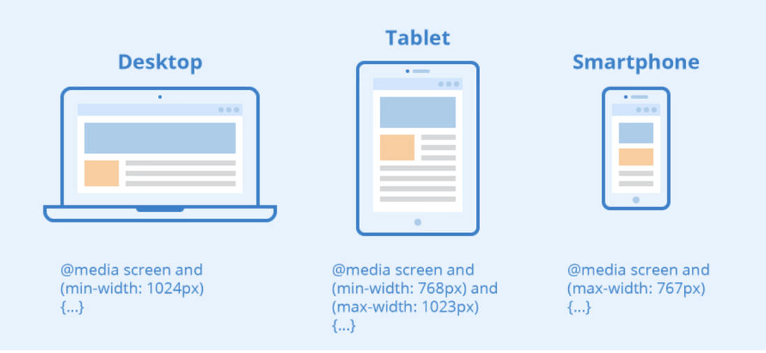
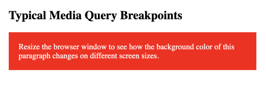
Breakpoint ສໍາລັບອຸປະກອນທົ່ວໄປ
ມີໜ້າຈໍ ແລະ ອຸປະກອນອື່ນໆ ທີ່ມີຄວາມສູງ ແລະ ຄວາມກວ້າງ ຕ່າງກັນ. ດັ່ງນັ້ນ, ຈື່ງຍາກໃຫ້ແກ່ການສ້າງ Breakpoint ສໍາລັບແຕ່ລະອຸປະກອນ. ເພື່ອໃຫ້ທຸກຢ່າງງ່າຍຂຶ້ນ ເຮົາສາມາດກໍານົດເປົ້າໝາຍເປັນ 5 ກຸ່ມ:
ຕົວຢ່າງ:
<!DOCTYPE html>
<html>
<head>
<meta name="viewport" content="width=device-width, initial-scale=1.0">
<style>
.example {
padding: 20px;
color: white;
}
/* Extra small devices (phones, 600px and down) */
@media only screen and (max-width: 600px) {
.example {background: red;}
}
/* Small devices (portrait tablets and large phones, 600px and up) */
@media only screen and (min-width: 600px) {
.example {background: green;}
}
/* Medium devices (landscape tablets, 768px and up) */
@media only screen and (min-width: 768px) {
.example {background: blue;}
}
/* Large devices (laptops/desktops, 992px and up) */
@media only screen and (min-width: 992px) {
.example {background: orange;}
}
/* Extra large devices (large laptops and desktops, 1200px and up) */
@media only screen and (min-width: 1200px) {
.example {background: pink;}
}
</style>
</head>
<body>
<h2>Typical Media Query Breakpoints</h2>
<p class="example">Resize the browser window to see how the background color of this paragraph changes on different screen sizes.</p>
</body>
</html>
ຜົນລັບ:
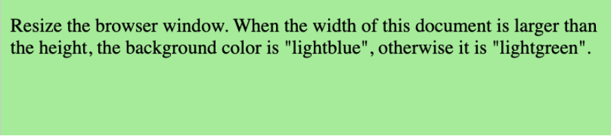
ການວາງແນວ: Portrait (ແນວຕັ້ງ) / Landscape (ແນວນອນ)
Media queries ສາມາດໃຊ້ເພື່ອປ່ຽນ layout ຂອງ page ແນວຂອງ browser
ເຮົາສາມາດມີຊຸດ CSS properties ທີ່ໃຊ້ໄດ້ສະເພາະເມື່ອໜ້າຕ່າງ browser ກວ້າງກວ່າຄວາມສູງເຊິ່ງເອີ້ນວ່າ: ການວາງແນວ "ແນວນອນ” (Landscape)
ຕົວຢ່າງ: ໜ້າ web ຈະມີພື້ນສີຟ້າອ່ອນຫາກການວາງແນວຢູ່ໃນໂໝດ Landscape
<!DOCTYPE html>
<html>
<head>
<meta name="viewport" content="width=device-width, initial-scale=1.0">
<style>
body {
background-color: lightgreen;
}
@media only screen and (orientation: landscape) {
body {
background-color: lightblue;
}
}
</style>
</head>
<body>
<p>Resize the browser window. When the width of this document is larger than the height, the background color is "lightblue", otherwise it is "lightgreen".</p>
</body>
</html>
ຜົນລັບ:
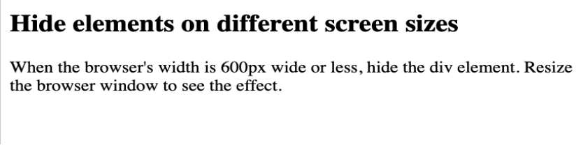
ການເຊື່ອງ (hide) Elements ດ້ວຍ Media Queries
ການໃຊ້ງານທົ່ວໄປອີກຢ່າງໜຶ່ງງຂອງ Media Queries ແມ່ນ ການເຊື່ອງ (hide) Elements ໃນຂະໜາດໜ້າຈໍທີ່ແຕກຕ່າງກັນ
ຕົວຢ່າງ:
<!DOCTYPE html>
<html>
<head>
<meta name="viewport" content="width=device-width, initial-scale=1">
<style>
div.example {
background-color: yellow;
padding: 20px;
}
@media screen and (max-width: 600px) {
div.example {
display: none;
}
}
</style>
</head>
<body>
<h2>Hide elements on different screen sizes</h2>
<div class="example">Example DIV.</div>
<p>When the browser's width is 600px wide or less, hide the div element. Resize the browser window to see the effect.</p>
</body>
</html>
ຜົນລັບ:
ການປ່ຽນຂະໜາດ Font ດ້ວຍ Media Queries
ສາມາດໃຊ້ Media Queries ເພື່ອປ່ຽນຂະໜາດ font ຂອງ element ໃນຂະໜາດໜ້າຈໍທີ່ແຕກຕ່າງກັນ
ຕົວຢ່າງ:
<!DOCTYPE html>
<html>
<head>
<meta name="viewport" content="width=device-width, initial-scale=1">
<style>
div.example {
background-color: lightgrey;
padding: 20px;
}
@media screen and (min-width: 600px) {
div.example {
font-size: 80px;
}
}
@media screen and (max-width: 600px) {
div.example {
font-size: 30px;
}
}
</style>
</head>
<body>
<h2>Change the font size of an element on different screen sizes</h2>
<div class="example">Example DIV.</div>
<p>When the browser's width is 600px wide or less, set the font-size of DIV to 30px. When it is 601px or wider, set the font-size to 80px. Resize the browser window to see the effect.</p>
</body>
</html>
ຜົນລັບ:
